
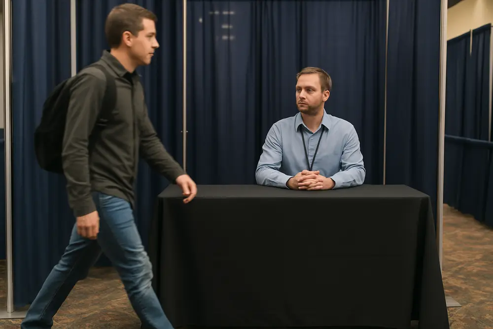
The most common trade show booth mistakes can make your space pretty difficult to enter. A table stretched across the entrance, a staff member planted in the opening, or a demonstration crowd blocking the aisle can tell attendees to keep moving without anyone saying a word.
The problem is more complicated than removing one counter. Your booth can have polished graphics and an expensive display while still feeling closed. Attendees notice where they can walk, what they can see from the aisle, and whether entering will trap them in an awkward sales conversation.
The Front Edge Sets the Tone
A table across the front of your booth creates a boundary similar to a checkout counter. Visitors stop at the perimeter, and your employees wait on the other side. That setup can work when you need controlled product handling, but it’s usually overkill for a booth built around conversation.
Move the table to one side or place it farther inside the booth. The replacement doesn’t require an elaborate custom structure. You need a visually obvious opening that an attendee can use without turning sideways, squeezing past a stool, or asking someone to move.
Tall shelving and banner walls can cause the same problem by hiding the interior. Keep the front open and position taller elements toward the rear. Because display-height and sightline restrictions differ by show, review the current exhibitor manual rather than assuming last year’s setup will be accepted. The International Association of Exhibitions and Events provides useful display guidance, but your specific show rules still control the floor.
Your Staff Can Become the Barrier
Your booth staff function as movable parts of the layout. Someone standing directly in the only opening blocks the space just as effectively as a literature rack, even if that person is smiling and ready to help.
Position your staff just inside the open edge and slightly to the side. An angled stance keeps the entrance clear and makes eye contact feel natural. Standing squarely at an approaching attendee can feel less like a welcome and more like an interception.
Stop Hiding Behind the Table
Employees seated behind a counter tend to look passive or unavailable. The visitor has to initiate the exchange, cross the boundary, and risk getting stuck in a sales pitch. Before, your staff waited for someone to lean over the table. After, they stand within the booth and let interested attendees enter before opening with a relevant question.
Break Up Closed Staff Circles
An inward-facing staff group makes your booth look like a private meeting. Visitors rarely want to interrupt employees who appear busy with each other, especially when the employees occupy the center of the booth. Use an open semicircle or staggered positions that leave visible room for another person to join.
Longer conversations belong toward the side or rear. The same goes for staff breaks. A phone in hand or an unfinished meal in the most visible area communicates that your team isn’t ready, regardless of what your signage promises.
Separate Browsing From Stopping
A workable booth needs one path for people entering and another place for those who have stopped. In a compact booth, these don’t need to be marked zones. You can create them by angling the monitor toward the aisle, recessing the demonstration area, and keeping the entrance free.
| Discouraging Setup | Practical Replacement |
|---|---|
| Table spanning the front edge | Table placed along one side |
| Monitor facing the back wall | Screen angled toward aisle traffic |
| Demo held in the entrance | Demo offset with a separate approach path |
| Chairs facing away from the aisle | Seating angled toward the booth interior |
| Headline readable only from inside | One concise message visible from the aisle |
Your headline should give people a reason to approach before they cross the booth boundary. Supporting copy can sit deeper inside. If your message needs several paragraphs to explain what you do, the booth graphic isn’t the place to solve that problem. Clear positioning belongs in your broader brand strategy, then the display can communicate the useful part quickly.
Accessibility Is Part of Hospitality
An opening isn’t useful when it leads to a dead end. For U.S. events, a 36-inch clear route is a useful baseline drawn from the U.S. Access Board’s accessible-route guidance. Your venue may impose additional requirements, and one acceptable measurement doesn’t make the entire setup accessible.
The complete visitor path matters. A wheelchair user may be able to enter but still lack room to approach your display or turn toward a staff member. The ADA Standards identify 30 by 48 inches as a general clear floor space for a stationary wheelchair, which can help you evaluate interactive displays. The 2010 ADA Standards provide the underlying federal criteria.
Exposed cords and abrupt floor transitions can make that route unusable for more than wheelchair users. Route cables away from foot traffic whenever possible. If a cable must cross a path, use an approved low-profile cover and follow the venue’s electrical requirements.
Storage shouldn’t steal the entrance either. Put shipping boxes and personal bags in concealed rear storage or inside a counter positioned away from circulation. Every fixture should earn its floor space. If a second literature stand doesn’t support the display or a conversation, remove it.
Watch the Booth in Motion
Your floor plan isn’t finished when the furniture arrives. Before the show opens, walk toward the booth from both aisle directions. You should understand the message and identify the entrance without slowing down to decode the setup.
Enter the booth as an attendee would. If you have to pivot around a chair or step over a cord, your visitors will face the same problem. Have someone stand at the main display while you repeat the test because an empty booth can hide bottlenecks.
The first busy period will reveal problems that a quiet setup cannot. Three people watching a demonstration may create a human wall. A productive conversation can drift toward the entrance. Move the demo deeper or shift the conversation before the obstruction becomes the normal arrangement.
Visitor behavior gives you useful follow-up signs. People who slow down but remain in the aisle may not understand where to enter. Visitors leaning over a counter instead of stepping inside suggest the front edge still feels closed. Staff repeatedly moving chairs or boxes indicates that the layout didn’t reserve enough circulation space.
Recheck the booth after meal breaks and session changes. Staff positions tend to drift, supplies appear near the front, and popular displays attract small crowds. Correcting those issues during the event is smarter than defending a floor plan that clearly isn’t working.
When Rep Lock Marketing plans event marketing, we look at the booth as a space people must be able to read and enter, not as a collection of graphics. Keep watching who approaches, where they stop, and what forces them back into the aisle. Those patterns will show you which trade show booth mistakes to fix before your next event.