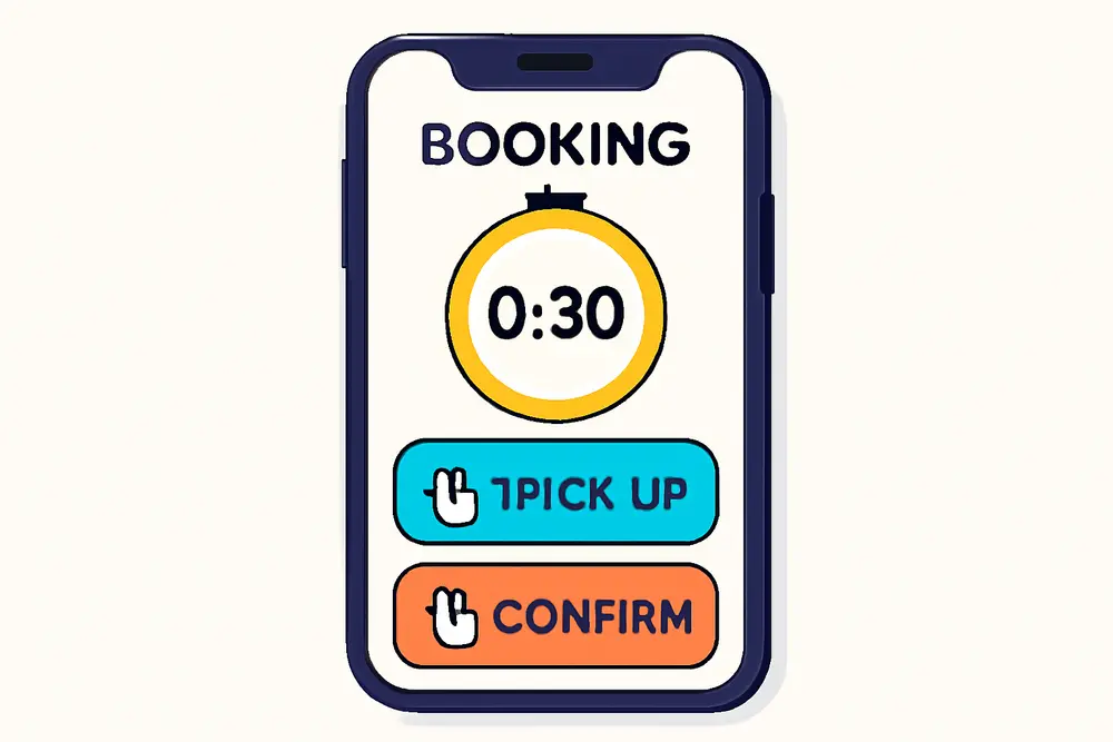
Busy locals are not scrolling your site at 9 PM hunting for a tiny calendar. They want a clear Book Now button, two effortless taps, and instant confirmation. That is the promise of 2-click mobile booking UX. In this guide, you will build a frictionless scheduling flow that runs on no-code tools, trims fields to essentials, preselects times, keeps CTAs sticky, adds trust where it matters, sends confirmations and reminders, and tracks conversions so you can prove ROI. If your goal is bookings in under 30 seconds on a phone, you are in the right place.
Why Speed Wins on Mobile
On mobile, attention evaporates with every extra field, redirect, and scroll. A slow flow signals hassle, which turns browsers into bouncers. A fast flow signals confidence, which nudges intent into action. That is why your mobile booking UX has to minimize decisions and thumb-work. In practice, that means one visible Book Now button that opens a short list of near-term time slots, a preselected service when possible, and autofill-friendly fields that do not require a thumb marathon. If you are wondering how strict the 30-second target is, treat it like a North Star. Your goal is not a perfect stopwatch score, it is a flow so clean that a busy neighbor can book while waiting for coffee.
Pick The Right No-Code Tool
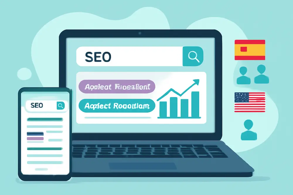
You do not need custom code to achieve frictionless scheduling. You do need a scheduler that is fast on mobile, embeds cleanly, syncs calendars, and supports confirmations, reminders, and tracking. Look for three things: a responsive widget with big tap targets, deep links that preselect the service or time range, and flexible confirmations with SMS plus email. If you also take deposits, payment integration matters. Popular options include Calendly, Squarespace Scheduling (formerly Acuity), Square Appointments, Cal.com, Setmore, and SimplyBook.me. They all handle the basics, but performance and small UX details vary. If the widget forces several screens before showing times or hides the soonest availability, keep shopping. The best tools load times first, not forms first. When you test, do it on a midrange phone over regular LTE, not a desktop on fiber.
| Tool | Mobile Widget | SMS Reminders | Payments | Deep Links |
|---|---|---|---|---|
| Calendly | Fast, responsive | Yes on paid plans | Stripe, PayPal | Event-type links |
| Squarespace Scheduling | Clean, customizable | Yes | Stripe, Square, PayPal | Prefilled options |
| Square Appointments | Simple, service-first | Yes | Native with Square | Service links |
| Cal.com | Fast, flexible | Via integrations | Stripe | Route-based links |
For an overview of friction points and what to cut, these primers are handy: CalStack on reducing booking friction and broken flows, and Schedly on making scheduling truly mobile friendly. They both reinforce the core idea here: fewer steps, faster load, clearer decisions. Sources: CalStack and Schedly.
Trim The Form To Essentials
Every extra field is a speed bump. On mobile, speed bumps feel like walls. Front-load only what you cannot live without to secure the appointment. Name and a way to reach them are non-negotiable. Everything else can wait. If you must collect both phone and email, use one-tap providers like Apple autofill and mark fields as optional when you can. Resist the urge to gather service details before the booking is locked. Instead, schedule first, then send a short follow-up form or text link for add-ons, photos, or addresses if needed. If your scheduler allows one-line name fields, use them. If you have to split first and last, turn on mobile optimization so the keyboard shifts to name mode and the Next button advances cleanly. The target is a single screen with two inputs that a customer can blast through without thinking.
Preselect Times That Fit
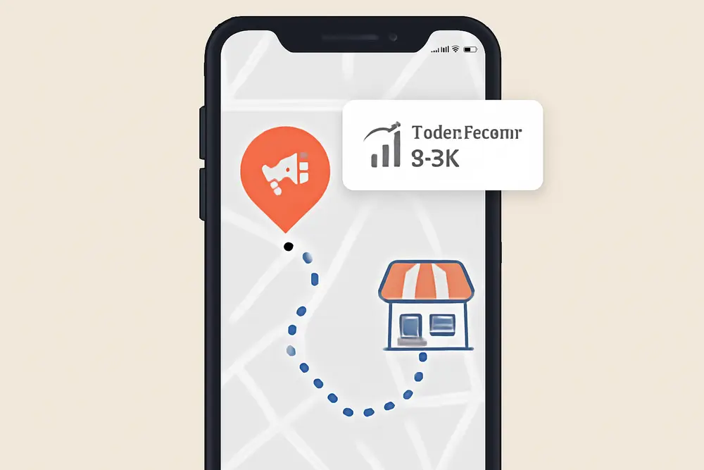
Busy people do not want to hunt through a full calendar grid on a phone. Surface the best options instantly. Preselect the service to remove a choice step. Show the soonest relevant day automatically. If your hours are wide, offer a quick toggle like Morning or Afternoon so customers can land on a small set of slots. Keep the list short and scannable with large, tappable buttons. You can apply smart defaults too: if most bookings land at 9 AM, place those first in the visual order. If your tool supports it, add a direct link or CTA like Book First Available Today that lands on the next open slot, ready to confirm. If you run multiple team members, enable pooled availability so the customer only sees one fast path to a time, not a team directory. The less scrolling, the better the conversion.
Use Sticky CTAs That Stay Put
A floating Book Now button that never leaves the viewport is your conversion engine on mobile. Place it as a sticky bar pinned to the bottom of the screen or as a floating bubble that expands to show times. Keep the label short and clear like Book Now or See Times. The thumb target should be big enough to pass the 44 px guideline. If your page has service sections, repeat context-aware CTAs near each description that deep link to the right scheduler event, so nobody has to pick a service again. To build this with no code, use your site builder to add a fixed-position button that opens a scheduler embed, a slide-over panel, or a direct booking link. In WordPress, most page builders support sticky elements, and many schedulers provide an inline embed plus a pop-up widget that you can trigger from any link. Place one primary CTA above the fold, one persistent sticky CTA, and then a final one immediately under your reviews. That trio covers scanners and readers without feeling pushy.
Add Trust Where It Counts
Frictionless scheduling still needs proof, especially for local services. Pair your booking widget with tight, local trust signals. A single real review, a small star rating with total count, and one or two assurance bullets can do the job. Place this directly above or below the scheduler so it is seen at the decision moment. If you hold licenses or carry insurance, a compact badge row helps. Show the actual faces behind your service near the booking area so customers know who is showing up. You can lean on your product and CTA clarity too. Our post on turning GBP products into nonstop sales breaks down how to present scope, price anchors, and photos for conversion. The same idea carries into booking UX: crystal clear service scope, proof it is local and legit, then an easy path to schedule. Reference: Turn GBP Products into 24/7 Sales.
Confirmations and Reminders, No Code
Confirmations are not paperwork. They are customer confidence and no-show insurance. Set your scheduler to send an instant confirmation by email and SMS that includes the time, service, who is coming, and a friendly reschedule link. Add an .ics calendar file so the event lands in their phone calendar with one tap. Then schedule two reminders: 24 hours before and 2 hours before. If you are appointment-heavy, consider a short day-of check-in text with a team photo and an On Our Way message. For reschedules, do not bury the link. Put it in the confirmation and reminders to lower friction and reduce total ghosted slots. For teams that want to filter out bad fits, treat the booking as the micro-commitment and attach a short auto-email asking for one or two qualifying details. Keep it lightweight, and never block the calendar.
Track Conversions and ROI
If you do not measure your mobile booking UX, you cannot improve it. Track three layers: clicks on Book Now, starts on the widget or booking page, and confirmed appointments. The simple route is a redirect to a thank-you page after booking and a GA4 event when someone lands there. If your scheduler does not support redirects, use its built-in analytics plus events on the button tap and on the widget confirmation state. Add UTM parameters to every booking link so you know which page section, ad, or social post produced the booking. If you run ads, fire a conversion event from the thank-you page and import it into Google Ads or Meta Ads Manager. To get a read on speed, track the time from the button click to completion using your scheduler reports or a lightweight timer script that stamps the open time and the finish event. Even if you never code, most tools show average time to book and drop-off rates. Tie these to revenue with a simple multiplier for average job value.
Example: 2-Click Booking for a Local Service
Meet a fictional but realistic example: Southside Sink Rescue, a three-tech plumbing shop. Their old flow had a hero image, a call button, and a long contact form. On mobile, people bounced. The new flow aimed at frictionless scheduling. Here is how they did it. They switched to Squarespace Scheduling for clean mobile widgets and SMS reminders. They created deep links so anyone landing on the Drain Cleaning service page jumped straight to that event type. They pinned a sticky Book Now bar to the bottom of the screen that opened the scheduler in a slide-over panel. The scheduler showed Today and Tomorrow by default with Morning and Afternoon toggles. The form asked for name and phone only, with email optional. They added one real Google review and a small Licensed and Insured badge right under the widget. Confirmations went out instantly with a link to reschedule. Reminders hit 24 hours and 2 hours before the slot. For tracking, every Book Now button had UTM tags, and the scheduler redirected to a clean thank-you page where GA4 and the Meta pixel recorded conversions.
What changed on mobile? Customers now tapped Book Now, saw the next few times immediately, picked one, and autofilled their info. The shop watched average time to book drop to under a minute and saw a clear lift in bookings from social posts since those CTAs linked straight to preselected services. No-show rates eased once the 2-hour SMS reminder landed. Best of all, the owner stopped chasing missed calls every afternoon because customers were booking during their breaks, not waiting on voicemail.
Connect the Dots With Your Offers
Frictionless scheduling shines when your offer is clear. Pair the 2-click flow with tight service pages that answer what you do, where you do it, what it costs or starts at, and what is included. If you already have strong CTAs and value props, carry that into the booking widget. Title the event in plain English. Keep durations accurate so people do not fear a mystery half day. Irresistible offer framing works here too. Our lead gen framework covers clean value props and relevant CTAs that map neatly to this booking approach. You can grab ideas on positioning and conversion tracking here: Improve Your Lead Generation.
Design Tips That Convert on Small Screens
When you lay out the mobile view, space and contrast are your friends. Keep the booking widget on a clean background with strong contrast and generous spacing between time buttons. Avoid placing dense text blocks above the scheduler. If you need to explain options, tuck a short, skimmable line just above the times like Pick a 1-hour window below. Keep finger targets big with at least 12 px spacing. Reduce header clutter so the sticky Book Now does not have to fight a sticky nav and a promo banner at the same time. If you run multiple services, use clear cards with one-sentence scopes and small icons, then deep link each card to its specific event type. On the confirmation screen, give customers one immediate next step like Add to Calendar or Message Us if you have questions. That turns momentum into fewer cancellations.
Payments, Deposits, and No-Shows
Collecting a small deposit can slash no-shows, but only if the payment step is lightning fast. If you add payment, enable Apple Pay and Google Pay where available and keep it optional for low-risk services. For high-demand slots, a refundable deposit might make sense. Many schedulers support Stripe and can present express checkout wallets. If you prefer not to take payment upfront, consider a credit card on file for certain categories. If that feels too heavy for your market, rely on the 2-hour reminder plus a one-tap reschedule link to reduce last-minute gaps. Do not combine heavy deposits with long forms. You will create friction without enough upside. Treat payment as a conversion lever you test, not a default setting for every service.
Content That Tees Up The Tap
Booking is the finish line, but your content guides people there. Make sure the first screen on mobile answers three things in one glance: what you do, where you do it, and how to book. Pair a short headline with a quick trust signal, then place your sticky CTA. Use real photos whenever possible. If your site leans on stock images, at least place a real team photo or a recent job snapshot near the booking area. Keep service copy simple and benefit-forward. If an offer needs a lot of explanation, you can use an accordion to keep the page tight without hiding the Book Now. Video can help if it is short and muted, but do not let it shove the scheduler below several scrolls. Booking should never be out of sight on the first screen.
Launch Checklist
Here is a quick launch flow you can run this week. Pick a scheduler with a fast mobile widget and SMS reminders. Set up one event type per service and generate deep links for each. Embed the widget near the top of your key service page. Add a bottom sticky Book Now button that opens the scheduler. Trim the form to name and phone, email optional. Default the scheduler to Today and Tomorrow with a simple Morning and Afternoon view if possible. Place one short review and a small assurance badge beside the scheduler. Set instant confirmation plus 24-hour and 2-hour reminders with a reschedule link. Redirect confirmed bookings to a thank-you page with GA4 and any ad pixels. Tag all booking links with UTMs and check your reports after a week. Then trim one more field or one more scroll and watch completion times drop.
FAQ: 2-Click Booking
What does 2-click mobile booking really mean?
It means the customer can open your scheduler and pick a time with two quick taps. Tap 1 opens the scheduler from a sticky Book Now. Tap 2 picks a visible time slot. Autofill handles their info. If a third tap is needed to confirm, you are still aiming for under 30 seconds.
Do I need a developer to set this up?
No. Modern schedulers embed with a small code snippet or pop-up widget, and most site builders offer sticky buttons and slide-overs. You can wire confirmations, reminders, and even payments without writing custom code.
Which fields should I collect before the booking?
Name and one contact method, ideally phone for SMS reminders. Everything else can follow by automated message or a post-booking short form.
How do I track conversions if the scheduler is on a different domain?
Use the scheduler redirect to a thank-you page on your domain and track that page view as a conversion. If redirect is not available, use the tool’s built-in conversion reporting and add click events on your Book Now buttons. Tag links with UTMs so you can attribute bookings to campaigns.
Can I still qualify leads without hurting conversion?
Yes. Lock the time first, then send a short follow-up asking for details or photos. You keep the friction out of the initial flow and still get what you need to prepare.
Your Next 48 Hours
If you are serious about frictionless scheduling, pick a scheduler tonight, embed it tomorrow, and make your Book Now sticky by the end of the week. Keep your eyes on one metric for the first sprint: time to book on mobile. Shorten it with one change at a time. Trim the form. Preselect the service. Expose the soonest times. Add the reschedule link. Then track the wins. When locals can book in under 30 seconds, they will. And your calendar will show it.