Most local businesses treat the thank-you page like a receipt. Big mistake. Right after someone fills out your form or calls from your ad, they’re at peak interest. That “thanks for contacting us” screen can either let the momentum die or turn into a conversion engine with instant booking, directions, trust signals, referral prompts, and SMS opt-ins. In one analysis, teams that added clear “what’s next” content on thank-you pages saw trial activation jump 18 percent and users were 2 times more likely to convert later on, which is a strong proof point that this real estate sells when you treat it like a sales page instead of a dead-end slip (Content Hurricane). This guide shows you how to use thank you page optimization and post-conversion personalization to boost show rates, reviews, and revenue.
What a Thank-You Page Should Do
A thank-you page has one job: guide a hot prospect to the next meaningful step while trust is fresh. That means making it effortless to book, find you, learn what to expect, and keep the relationship going. Layout and messaging should be as intentional as your homepage. Lead with a single primary action, then back it up with helpful context and proof.
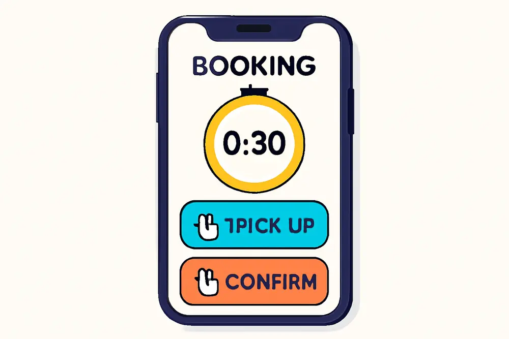
Immediate next steps are the backbone. If your service needs a scheduled slot, let them lock it in now with an embedded calendar or a “Choose Your Time” button. If they’re coming to you in person, put a big “Get Directions” button above the fold, followed by a map, parking guidance, and arrival tips. If your offer requires prep, add a short “Before You Arrive” checklist or a one-minute video. Each of these cuts friction that would otherwise turn excitement into no-show or ghosting.
Trust signals are your risk reducers. Customers are wondering if they made the right move. Prove they did with star ratings, a short review excerpt, recognizable badges like Yelp and BBB, and any local awards. Adding visible trust signals is consistently ranked as a top conversion lever for local websites, so it belongs on your thank-you page too, not just your homepage (Rep Lock Marketing).
Personalize by Traffic Source
Post-conversion personalization is the practice of tailoring your thank-you page content based on where the visitor came from, what they searched for, or which offer they saw. If you spent money convincing someone with “same-day” or “free consult” messaging, keep that thread going. Relevance is currency.
Here’s how personalization by source pays off for local businesses:
Ad campaign continuity. If a visitor clicked your Google Ads keyword “emergency plumber near me,” your thank-you page should acknowledge urgency and display today’s availability. A line like “Great news, we have two same-day slots left” aligned with a live scheduler reduces hesitation and improves show rate.
Referral partner context. If they came from a dentist’s referral link or a realtor’s resource page, name that partner and set expectations. “Referred by Summit Dental? We’ll coordinate records for you. Choose your time below.” You’ll inherit trust by association.
Organic and map pack intent. If a user arrived from Google Business Profile clicks, emphasize directions, parking notes, and arrival timing. If they came via a guide on your blog, include a related resource to deepen their path.
To implement, use URL parameters like utm_source, utm_campaign, or a custom query string such as ?offer=same-day. Pass those values into hidden form fields and fire them into your CRM. On the thank-you page, swap headlines, CTAs, and supporting text based on those parameters. You can do this with your CMS, a personalization tool, or a few lines of logic through your tag manager. Keep your variations tight and outcome-focused so you are not managing a content sprawl. Start with three variants that mirror your top traffic buckets, such as “same-day,” “referral,” and “in-office visit.”
High-Impact Elements That Convert
Your layout should be simple, direct, and stacked in the order people make decisions. Start with confirmation, then the primary action, then proof, then your referral and loyalty plays, and finally your SMS channel opt-in.
Instant Booking and Appointment Triggers
Make it easy to commit on the spot. Embed a scheduling widget or link to a fast-loading booking flow. If you already collected date preferences in the form, preselect options to reduce taps. Add an “Add to Calendar” link so your slot lands in their device with one tap. The goal is to collapse time-to-commit since every extra hour between form submit and commitment increases drop-off. Use urgency that feels real, not gimmicky, like “Evening slots fill fast, grab yours now.”
For teams with inbound calls, add a “Talk to Us Now” button with click-to-call and business hours. If you serve multiple locations, detect the nearest one and prefill the scheduler for that site.
Directions and Parking
Local means local. People want to know exactly where to go and how to get in. Place a large “Get Directions” button that opens their preferred maps app, followed by an embedded map. Add short, plain-English tips such as “Park in the lot behind the brick building” or “We’re on the second floor, Suite 204, use the elevator near the cafe.” These tiny details shrink anxiety and no-shows. Include office photos or a storefront picture so they recognize your entrance instantly.
Trust Signals That Reduce Risk
Trust is often won or lost right after a form submit. Showcase a 5-star review with a short, specific quote that addresses common objections. Add any third-party logos your customers already trust such as Yelp, BBB, local news features, or “Best of” awards. Rep Lock advocates placing award badges with clear calls to action because they compound credibility at the exact moment someone is deciding whether to follow through (Rep Lock Marketing). Add a short “What to Expect” section that explains the next step in friendly language so there are no surprises.
Referral Prompts That Spread the Word
The best time to ask for a referral is when someone just said yes to you. A light, high-visibility prompt works wonders: “Know a friend who needs this too? Share your custom link and we’ll send them a new-patient discount.” You can offer a small thank-you such as a gift card drawing or service upgrade, but keep it simple and compliant with any industry guidelines. Referral platforms confirm that post-purchase or post-lead moments are high-conversion windows for referral asks, so place this below your primary CTA and proof (Tolt).
Pro tip: add one-click share buttons for SMS and email so people can recommend you without leaving the page. If you work with referral partners, include a line acknowledging them to reinforce the relationship.
SMS Opt-Ins That People Welcome
Texting can lift show rates with reminders and two-way confirmations, but you need clean consent. The thank-you page is a prime moment for SMS opt-in because intent is high and you can clearly explain the benefit. Offer something tangible like “Get appointment reminders, arrival tips, and 1 VIP offer monthly.” Keep the checkbox unchecked by default, present consent language near the button, and avoid any hint of coercion.
For compliance and trust, include clear disclosures: that by opting in they agree to receive recurring automated messages, message and data rates may apply, frequency expectations, and that they can reply STOP to opt out at any time. Maintain records of consent and honor opt-outs promptly. These practices are consistently recommended in SMS guidelines and best-practice resources for compliant texting programs (Textellent). Segment texts based on the person’s path and behavior so messages feel useful rather than spammy, which is reinforced in channel best-practice playbooks (Tajo).
Sample consent copy you can adapt: “Yes, text me updates and reminders. Approximately 3 msgs per month. Reply STOP to cancel. Terms and Privacy links below.” Keep it short and linked to fuller policies in your footer.
UX and Legal Basics
Clean UX turns clicks into shows. Your thank-you page should load in under two seconds on mobile, stack content vertically with generous spacing, and stick to one big primary CTA near the top. Use high-contrast buttons, 16 px or larger font sizes, and thumb-friendly tap targets. Compress images, lazy load any carousels, and avoid heavy third-party scripts that slow the experience. If you embed a booking widget, test it on mid-tier Android devices and older iPhones since that is where most friction hides.
Keep copy human. People just said yes to you, so talk like a person. “Thanks, you’re booked for Thursday. Add this to your calendar and we’ll text you parking tips the day before” sounds better than “Your submission was successful.” Avoid complicated layouts, thin gray text, and fancy animations that make things jump while users are trying to tap.
For accessibility, label images with alt text, ensure form success messages are readable by screen readers, and respect prefers-reduced-motion. These details help everyone and reduce confusion that can lead to missed appointments.
Legal hygiene matters. For SMS, get express consent, disclose what you will send, store time-stamped consent records, and provide an easy opt-out path. If you operate outside the United States, align with your region’s rules as equivalents to TCPA may apply. Keep referral incentives aligned with any medical, financial, or industry-specific regulations you operate under. A small thank-you like a swag item or charitable donation often threads the needle without raising compliance flags.
Measure What Matters
Thank-you pages sit in the middle of your funnel, so treat them like performance assets. The right metrics connect this page to revenue instead of vanity numbers.
Show rate. Track the percentage of leads who actually show to appointments. When you add instant booking, directions, and reminders, you should see this line move. Segment by traffic source to learn where your content solves the biggest drop-offs.
Downstream actions. Measure how many users tap “Get Directions,” add to calendar, start a call, or complete the booking widget. These micro-conversions are leading indicators that predict revenue.
Reviews and referrals. Count new reviews per month and track whether review requests tied to thank-you page flows produce more volume or better sentiment. Monitor referral link clicks and referred lead counts.
SMS performance. Watch opt-in rate, deliverability, reply rate to confirmations, and opt-out rate. If opt-outs spike, audit your consent copy and message frequency.
Revenue per lead and cost per show. Attribute shows and closed revenue back to the initial source using UTM parameters passed through the form. This closes the loop so you can bid more on the traffic that becomes revenue, not just clicks.
Testing. Run A/B tests on headline language, CTA placement, calendar embed vs button, and the presence of a review quote. Keep tests clean and run them for enough sessions to reach directional confidence. Many teams see lift by testing a map and parking block directly under the hero for in-person services. Always log your experiments so wins become standard and losses do not get repeated.
Step-by-Step Build
Start with a simple wireframe and a single goal. Then add the pieces that nudge people to that goal as quickly and confidently as possible. Here’s a practical build order you can execute this week.
First, craft a friendly confirmation headline like “Thanks, You’re All Set. Here’s What Happens Next.” Keep it short, positive, and outcome-focused. Immediately below, place your primary action. If your sales process requires scheduling, make the primary action a full-width “Book Your Time” button or an embedded scheduler. If your process is walk-in or phone-first, lead with “Get Directions” or “Call Us Now.”
Second, insert support that reduces friction. Add a prominent “Add to Calendar” link, followed by a map block with a “Get Directions” button that opens Apple or Google Maps. Include a one-paragraph “Before You Arrive” section. If your service is remote, replace directions with a “Join Link Will Arrive via Email and Text” explainer or a tech check tip.
Third, layer proof. Add a review with a first name and neighborhood if permitted. Drop in logo badges for any recognitions. Limit this to three or four items so it supports rather than distracts.
Fourth, make the referral ask. Offer one concise incentive and include a one-click SMS share option. Craft copy that feels natural, like “If someone you care about could use this, tap to share your link.”
Fifth, present the SMS opt-in with clear value and compliant language. Offer reminders and helpful nudges, not a promo blast. Place your checkbox and consent text near the opt-in button so it is unmissable. Link to your terms and privacy policy in the footer.
Sixth, personalize by source. Use parameters like utm_source and utm_campaign to swap the headline subtitle. Example variants you can launch fast:
If source contains “googleads” and keyword signals speed: “You found us searching for same-day help. Good news, appointments are open today. Choose your time.”
If source equals “referral-summit-dental”: “Thanks for trusting Summit Dental’s recommendation. We’ll coordinate your records so your visit is smooth. Book your spot.”
If source equals “maps”: “Headed our way now? Tap for directions and parking tips. We are right next to the community garden.”
Seventh, instrument analytics. Fire events for primary and secondary actions, pass UTMs into your CRM, and tag SMS consent events so you can filter customers who agreed to texts. Test the full path on 4G mobile to catch load delays or layout shifts.
| Element | Why It Matters | Primary Metric | Tool Tip |
|---|---|---|---|
| Instant Booking | Locks commitment while intent is high | Bookings per 100 thank-you views | Embed your scheduler or link to a fast modal |
| Directions | Reduces no-shows and arrival confusion | Clicks on Get Directions | Open native maps with one tap |
| Trust Signals | Overcomes last-minute doubt | Downstream action rate after proof | Limit to top 3 recognitions |
| Referral Prompt | Turns yes-moments into advocacy | Referral link shares and leads | One-click SMS and email share |
| SMS Opt-In | Enables reminders that boost show rate | Opt-in rate and opt-out rate | Clear consent and frequency control |
| Source Personalization | Continuity from ad to action | Variant conversion rate | Swap copy via UTMs |
Thank You Page Optimization Examples
If you run a med spa and your traffic splits between Instagram promos and Google “laser hair removal near me,” your thank-you variants should reflect that. Instagram leads expect visuals and offers, so your variant could lead with “Thanks, your consult is locked. Tap below to see this month’s VIP add-on.” Then show a quick before-and-after photo carousel and a scheduler. For the Google search variant, lead with “You picked the right place for precise, safe treatments. Map and parking below, then choose your time,” plus safety badges and a map block before the calendar.
A home services company can tailor the same way. From a “water heater repair” ad, the thank-you page should acknowledge urgency, display earliest availability, and present a “Text me arrival window updates” opt-in. From a neighborhood Facebook group referral, the page can say “Thanks, Brookside neighbors. Here’s what to expect during your visit,” followed by a quick checklist and a light referral prompt to keep the community flywheel spinning.
For a dental clinic, the directions block is everything. Add a building photo, a parking map screenshot, and the sentence “We validate parking in the structure on Elm St” to prevent last-minute frustration. Pair that with an SMS opt-in that promises a day-before reminder and a two-hour arrival nudge. These small details cut no-shows without pushing harder on pricing or promos.
UX Copy You Can Steal
Headline: “Thanks, You’re In. Here’s What Happens Next.”
Subhead for speed-focused ads: “Same-day times are open. Book now to claim yours.”
Primary CTA: “Choose Your Time” or “Get Directions.”
Proof blurb: “Rated 4.9 from 300+ local reviews. ‘They explained everything and parking was easy.’”
Referral ask: “Know someone who’d love this? Share your link to give them a first-visit perk.”
SMS consent: “Yes, text me reminders and tips. About 3 messages per month. Reply STOP to cancel.”
Common Pitfalls to Avoid
Do not bury the primary action. If the first thing a visitor sees is a long paragraph of thanks, you lost the moment. Place the key button where thumbs can hit it without scrolling. Avoid overloading with 10 badges and a 15-slide review carousel which can slow the page and distract from action. Keep your referral incentive clean and your disclosures visible, since complicated fine print erodes trust. Do not auto-subscribe anyone to texts. An unchecked checkbox with clear consent language protects you and builds long-term trust.
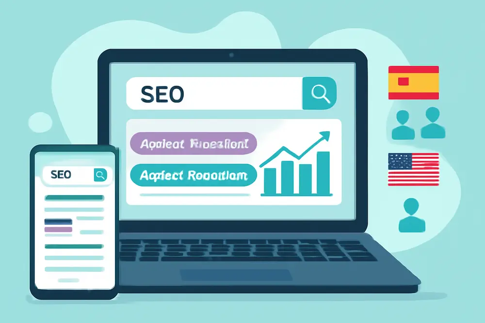
How to Align With SEO and PPC
When your thank-you page aligns with your ad and SEO promise, your quality goes up and wasted spend goes down. Use the same primary keyword theme in your page’s internal headings for continuity, such as “Same-Day Appointments Available” if that is your ad hook. Pass UTM parameters into your CRM so you can connect shows and revenue back to the query or campaign that started the journey. If “near me” queries are a major source, make sure maps, directions, and neighborhood references appear front and center. If your PPC value prop is a free consult, restate that value here with a short bulleted list of what the consult includes, then invite instant booking.
Quick Wins for Today
Add one big action above the fold. Pick “Book Now” or “Get Directions” and make that button impossible to miss on mobile. Most local thank-you pages improve quickly with this single change.
Drop in a single high-impact review and two recognizable badges. Keep it short and specific to reduce last-minute doubt.
Place a compliant SMS opt-in with clear value, then send a same-day welcome text that confirms the next step. Post-conversion is the best moment to set expectations and earn ongoing attention (Textellent).
If you want to go further, personalize one headline for your top ad campaign using UTMs. You do not need a complex system to win. A single source-aware line that says “We saved a spot for you today” can be the nudge that takes someone from interested to scheduled.